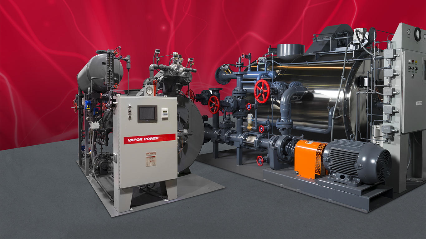
Precision Boilers manufactures industrial fuel-fired and electric boilers in Morristown, TN. They are a leader in high efficiency boiler systems and reached out to Balefire due to their experience with other manufacturers like Superior Boiler, Triad, English Boiler, and others.
The Problem
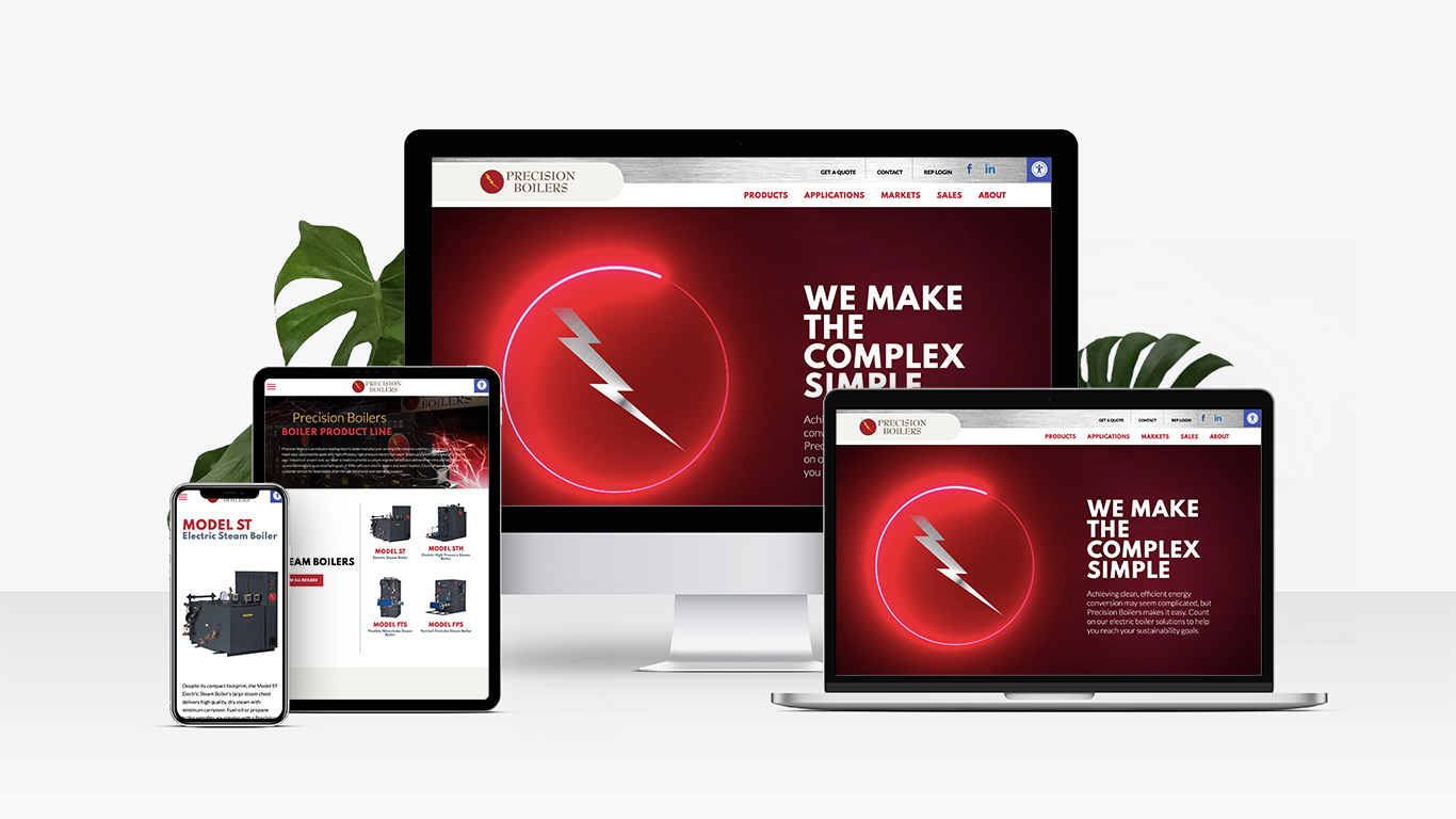
Precision Boilers needed Balefire to complete a branding process started by a previous agency. Their website was several years old, frequently crashed, and wasn’t producing many leads. While they had tried to optimize the website for search engines, that attempt was unsuccessful and they had fairly poor rankings on Google.
Project Scope
We adapted the previous agency’s work to craft a new content strategy for the website. We redesigned and redeveloped the website with all new content and a focus on SEO. The newly developed website was much faster than the old website with all the performance issues fixed. The new content quickly ranked higher on Google and user interactions greatly improved because the content was written to speak directly to their target audience(s). We continue to provide marketing support for Precision Boilers as well as their sister company, Vapor Power International.
Visit WebsiteBranded Graphics


